Promaster Mobile – App Redesign
Background
Orchard Systems have a 35 year history of designing software for the housing sector. They recently acquired an asset manage tool called Promaster to add to their portfolio. Promaster provides surveyors and their managers within housing associations with a tool to log and manage housing stock. Surveyors in the field conduct stock condition surveys logging the condition of kitchens, bathrooms, roofs etc. This data is then analysed within the housing associations in order to plan strategic works.
Following their purchase of Promaster, Orchard realised that the current Promaster mobile offering was in need of an update. It ran on outdated Windows CE handsets and the process was clunky for surveyors in the field. Orchards customers were requesting that the product be updated to work across iOS, Android and Windows for both mobile and tablet devices. The feeling was that business apps today should provide the same quality apps as those the surveyors were using at home. With this in mind Orchard approached City Interaction Lab and requested our aid in redesigning the app, making it more relevant and appealing for the surveyors.
Our Approach
Rather than just reproducing the old screens for the new platforms Orchard wanted to try something different in order to provide a better user experience for their end users. They took the bold step to follow the user-centred design process in redesigning the Promaster Mobile app completely. Collaboratively Orchard and City Interaction Lab conducted research with surveyors using the current Promaster Mobile solution in the field. We took insights from this to inform the design. Which we then evaluated with users.
We worked closely with the Orchard team throughout this project. They joined us on the shadowing sessions, fed back at each stage of the design process and were present for the user testing on the app. Whilst the research and initial design work was taking place the developers were able to work in parallel to ensure the database connectivity and framework were ready in time for implementation.
What we did
First we shadowed surveyors carrying out their roles in the office and the field. This included observing them using the current solution while explaining what they were doing. We focused on how well the current system was meeting their needs, what workarounds they had to use and which parts of the app were potentially time consuming.
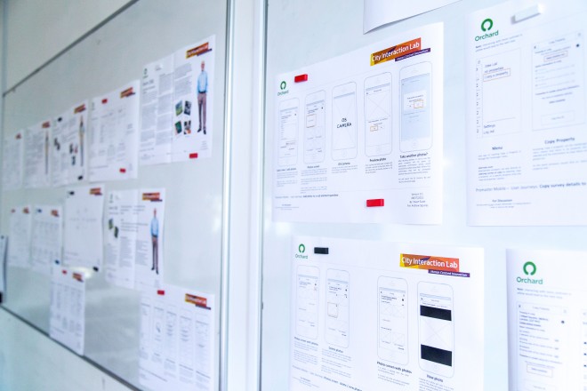
Based on the insights we created 2 primary personas that represented the key user types and were aimed at understanding the users’ goals, tasks and design considerations. Personas reflected the differing workloads of urban and rural surveyors. These personas were also supported by “Day in the life” stories that illustrated challenges that the personas faced within their role, such as not being able to answer a customer questions due to the lack of internet connection. To further support our personas and design we developed conceptual scenarios, which included short descriptions of a particular task from the users’ perspective describing the functionality of the proposed system.
Once high level functionality was agreed through conceptual scenarios, we produced task flows to map how users would make their way through the system. Based on these, we were able to begin sketching the screens for the key user journeys identified. After several revisions these were later mocked up in Axure to produce wireframes that showed each screen in the user journeys, its functionality and the users’ path between them. These were purposely kept black and white with a sketchy font to help people remember that they were drafts and open to changes.
Once the wireframed user journeys had been agreed amongst the project team we turned them into an interactive prototype that could be accessed via mobile handset and allowed users to explore key journeys in the app. This prototype was tested by actual surveyors that visited our lab and ran through key tasks, including one that we had previously shadowed. This allowed us to evaluate how well the designs met users’ needs and answer any outstanding questions. Users were pleased with the simplicity of the new solution and time saving features we included.
Outcomes
Following the users testing we refined the designs ready for implementation. A beta release and one more round of user testing are planned prior to the apps launch in early 2015. Orchard were so pleased with our outcomes we were invited to present on the project and UX in general at their annual conference.


